Best RON Platforms for eClosing
Compare the best RON platforms for title and settlement companies and...

Compare the best RON platforms for title and settlement companies and...
Remote online notarization (RON) is legal for real estate...
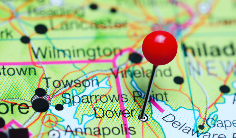
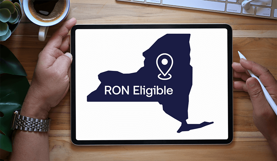
Delaware remote online notarization is closer to becoming permanent....
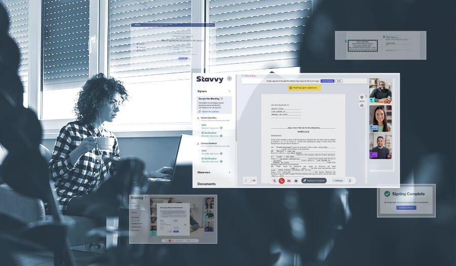
Save time, enhance security, and cut costs with RON software. Learn...
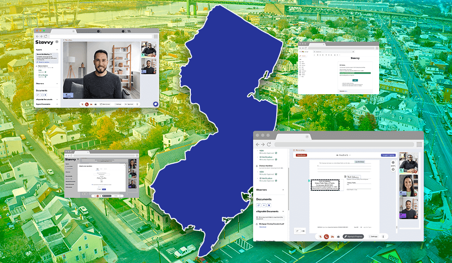
Interested in performing remote notarizations in New Jersey? Here’s...

Online notarization is now available for real estate transactions in...

Learn what questions to ask during your next RON platform demo so...

Angel Hernandez and Kosta Ligris discuss remote online notarization,...

Learn the top 5 things mortgage servicing leaders should continue to...